
VML: Sprite Squad
The Sprite Squad campaign motivates Gen-Z consumers to purchase and scan Sprite products for special rewards and content. I redesigned the user experience to boost engagement and sweepstakes entries.
Impact & outcome
Make rewards visible and lower barrier to engagement
Simplify sweepstakes entry
How to boost engagement for the campaign?
In June 2025, Sprite partnered with Eastside Golf, allowing users to enter sweepstakes on the campaign microsite for rewards. To boost participation and engagement, we plan to enhance the digital experience by improving clarity and usability. This is crucial for both user satisfaction and campaign success.
Current user flow has 15 steps to enter sweepstakes
When we looked at the data, the flow had 15 steps, with multiple drop-off points. Even small moments of confusion created measurable loss in engagement.
Users reveal a lack of clarity and visibility
From user interviews, we saw consistent patterns—confusion about how the system worked, unclear value in rewards, and difficulty finding the entry point.
Users experienced confusion between landing and partner pages, leading to drop-off during the entry process and reduced campaign conversion.
How might we reduce fragmentation and make the path visible, users will complete the flow with more confidence?
Collaborate on solutions with designers, project managers, and developers
We explored three directions: improving navigation, adding guidance overlays, and merging the experience into a single flow. We chose to merge because it reduced context switching and simplified decision-making.
01 Reduce Context Switching to simplify user journey
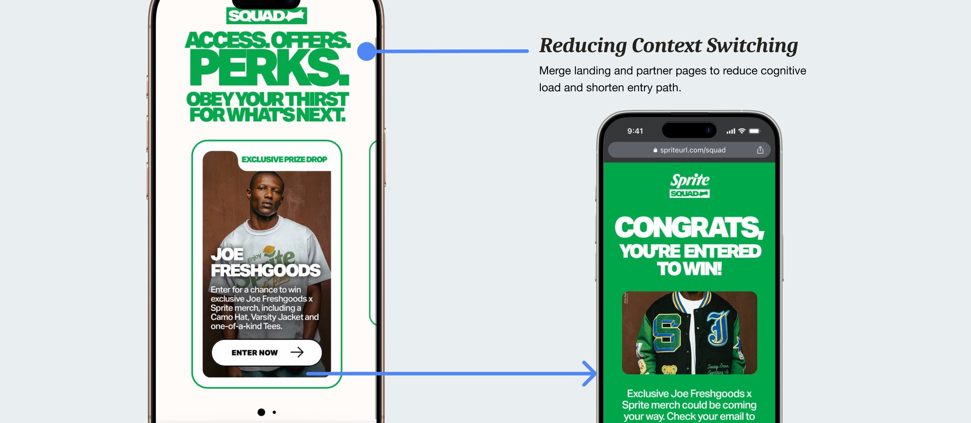
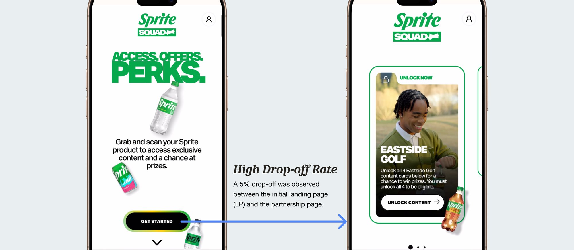
Before the redesign, there was a five percent drop-off between the initial landing page and the partnership page. Users had to move through multiple steps before understanding the rewards, which increased cognitive load and reduced motivation to continue. To address this, I proposed merging the landing page and the partner page into a single experience. This reduced the number of steps and shortened the entry path, which helped users understand the value proposition faster and lowered friction during onboarding.
02 Make rewards visible and lower barrier to engagement
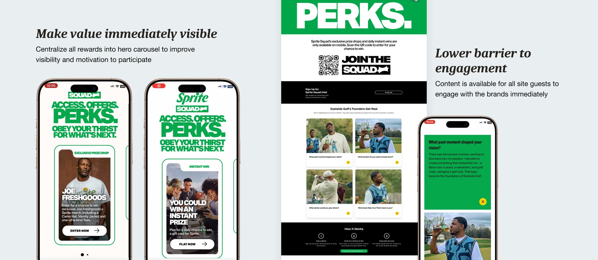
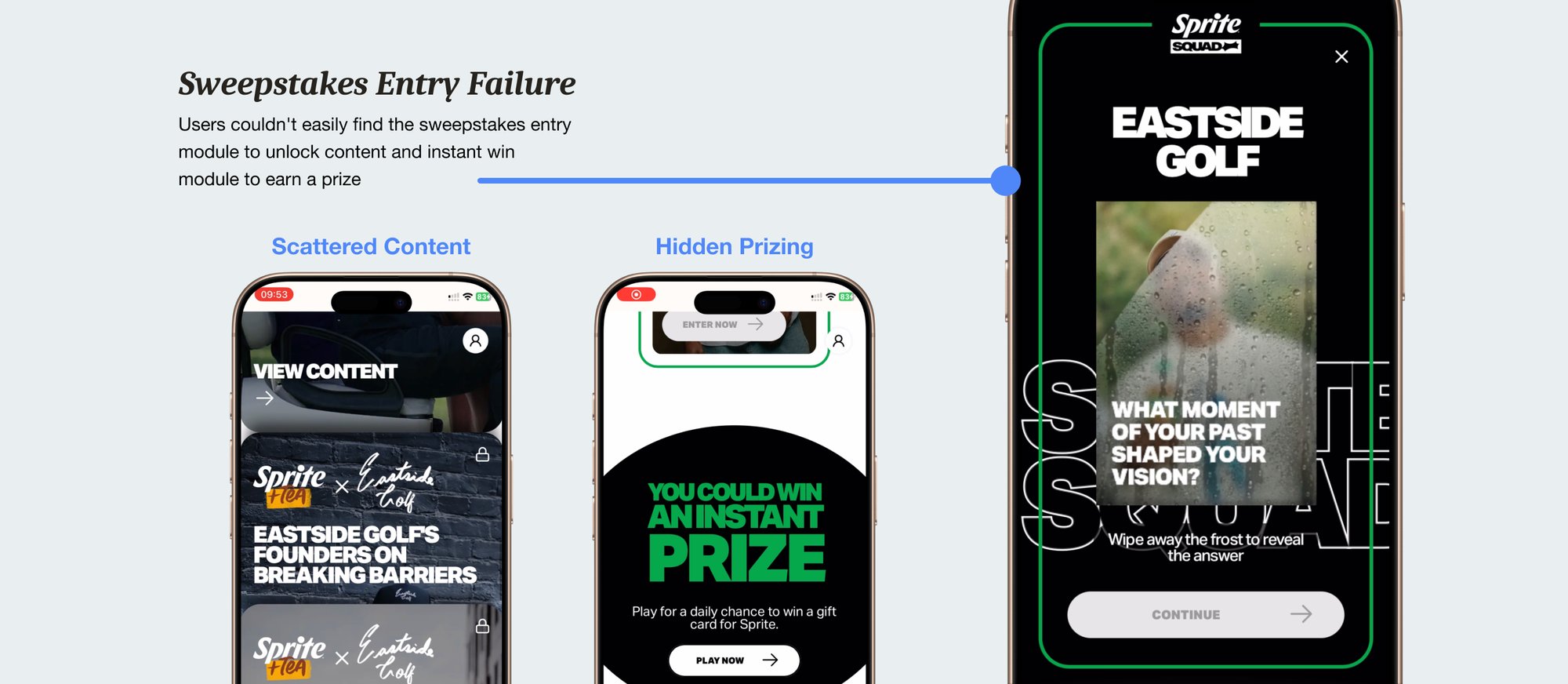
Another issue we discovered was that users couldn’t easily find the sweepstakes entry module. Content and rewards were scattered across different areas of the interface, which made participation confusing and reduced engagement. To improve visibility, I centralized all rewards into a hero carousel on the main screen. This made the incentives easier to find and helped users quickly understand what they could gain from participating, which increased motivation. And we lowered the barrier by allowing users to engage with content before committing. Instead of requiring users to unlock content through participation first, we allowed them to explore brand content immediately. This reduced friction and helped users build interest before taking an action.
Clarity in the flow directly translated into measurable engagement
As a result of simplifying navigation and improving visibility, the redesign led to a fifteen percent increase in sweepstakes entries and a three percent reduction in drop-off between key pages. This showed how improving clarity could directly impact both user engagement and business performance.
First time handing off designs to developers
I learned the importance of structured components, annotations, and early alignment with engineers to reduce rework and confusion. Designing within brand and design system constraints helped me understand how design systems create consistency and accelerate collaboration rather than limit creativity. This experience improved how I communicate design intent and prepared me to collaborate more effectively in cross-functional teams.
Reflection
This project reinforced that small UX improvements can drive measurable impact, and that clarity is critical when designing across multiple touchpoints.